IK-Onboarding — IntellectoKids
Problem
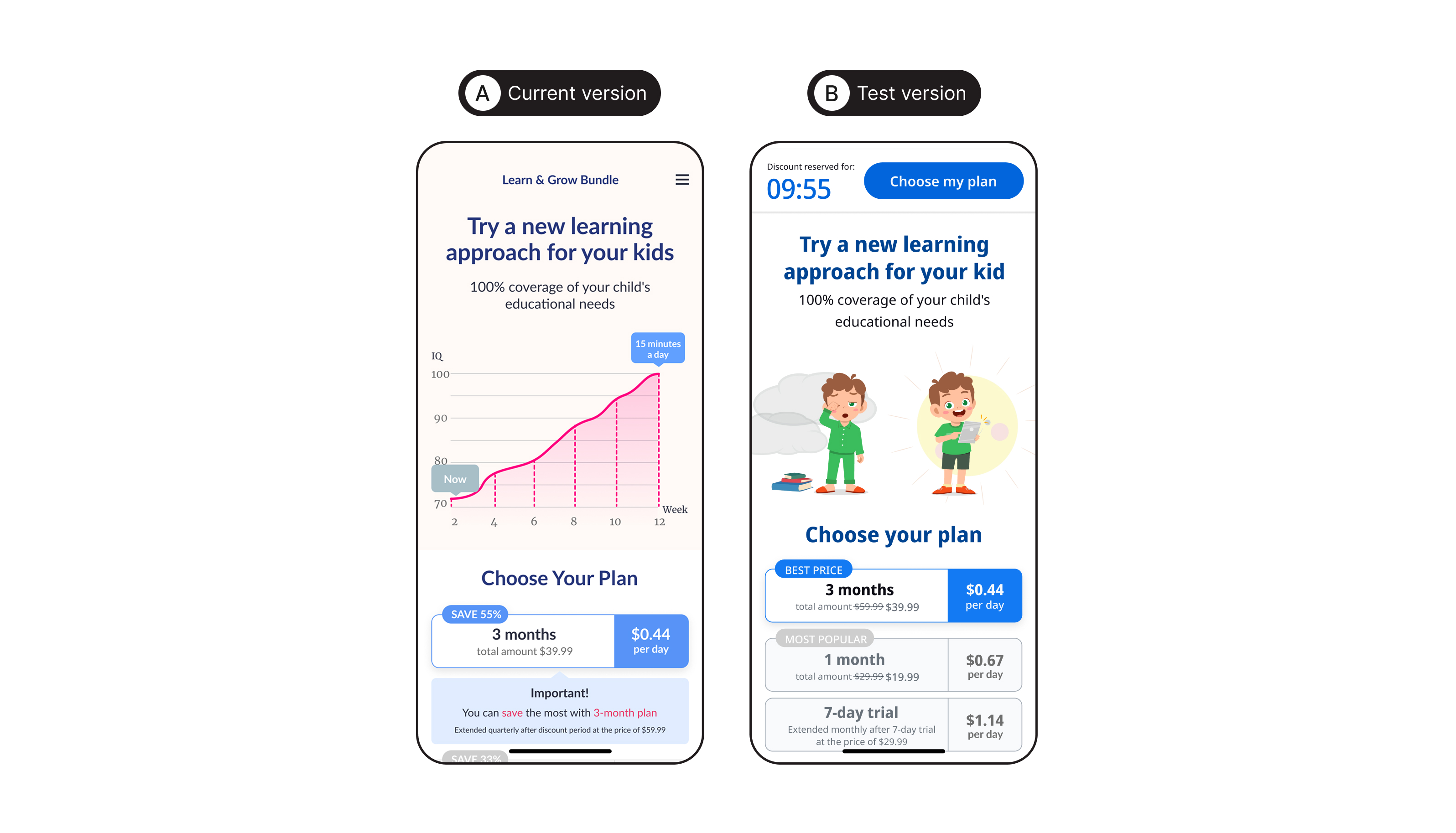
Our subscription screen was not performing effectively because most users chose the 7-day trial plan. The 3-month subscription was not visible or attractive enough, so users did not fully understand its value.
Insight
User behavior analysis showed that people respond better to screens where pricing and subscription options are visible immediately, without requiring scrolling. Limited-time offers, simple layouts, and clear visual hierarchy help users make decisions faster and increase interest in longer subscription plans.
Goal
- make pricing plans easier to compare
- increase visibility of the 3-month plan
- strengthen purchase motivation
- improve overall subscription conversion without negatively affecting trial starts
Key Task
The new paywall needed to increase conversion into the 3-month plan while maintaining strong performance for trials and short-term subscriptions. The main focus was simplifying decision-making, reducing distracting elements, and reinforcing value through visual hierarchy and urgency mechanics.
Competitor Research
- simple plan comparison
- before-and-after comparisons
- emphasis on the "best offer"
- urgency elements such as countdown timers and limited-time discounts
- pricing and subscription options displayed immediately on the first screen
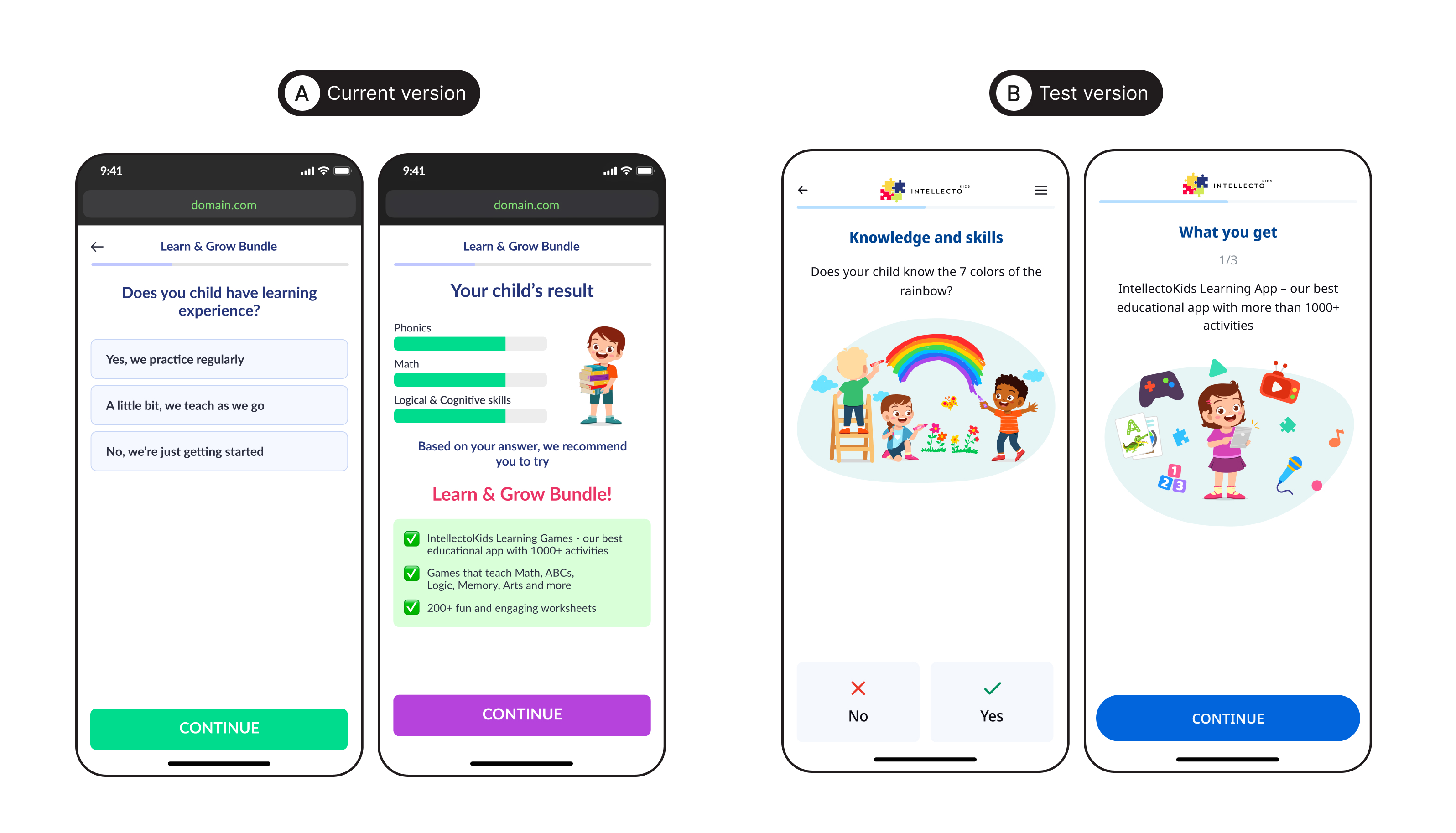
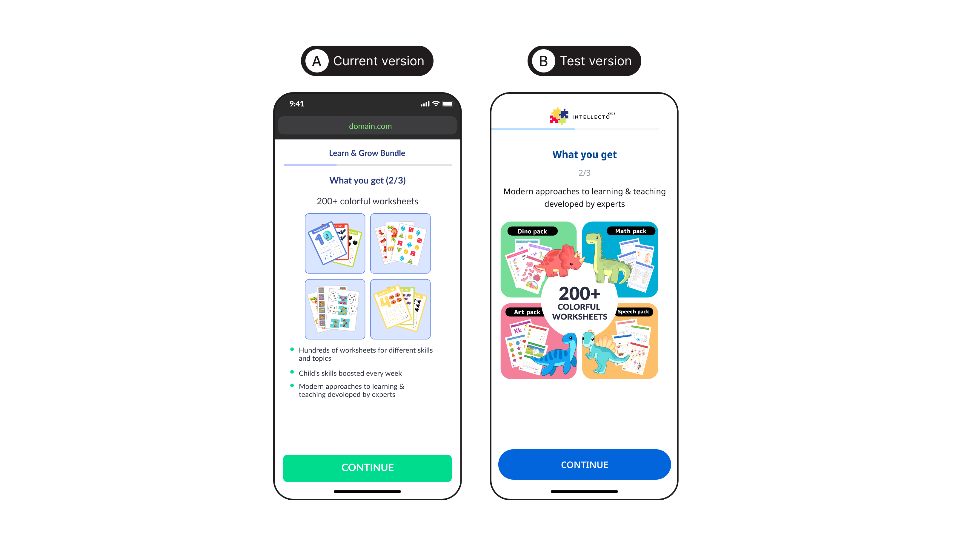
Hypothesis 1 — Pricing Visibility Above the Fold
In the previous version, users first saw marketing content and only later reached the subscription options. This slowed down decision-making and reduced attention to the pricing plans.
Displaying subscription options immediately would simplify the decision process and reduce unnecessary friction.
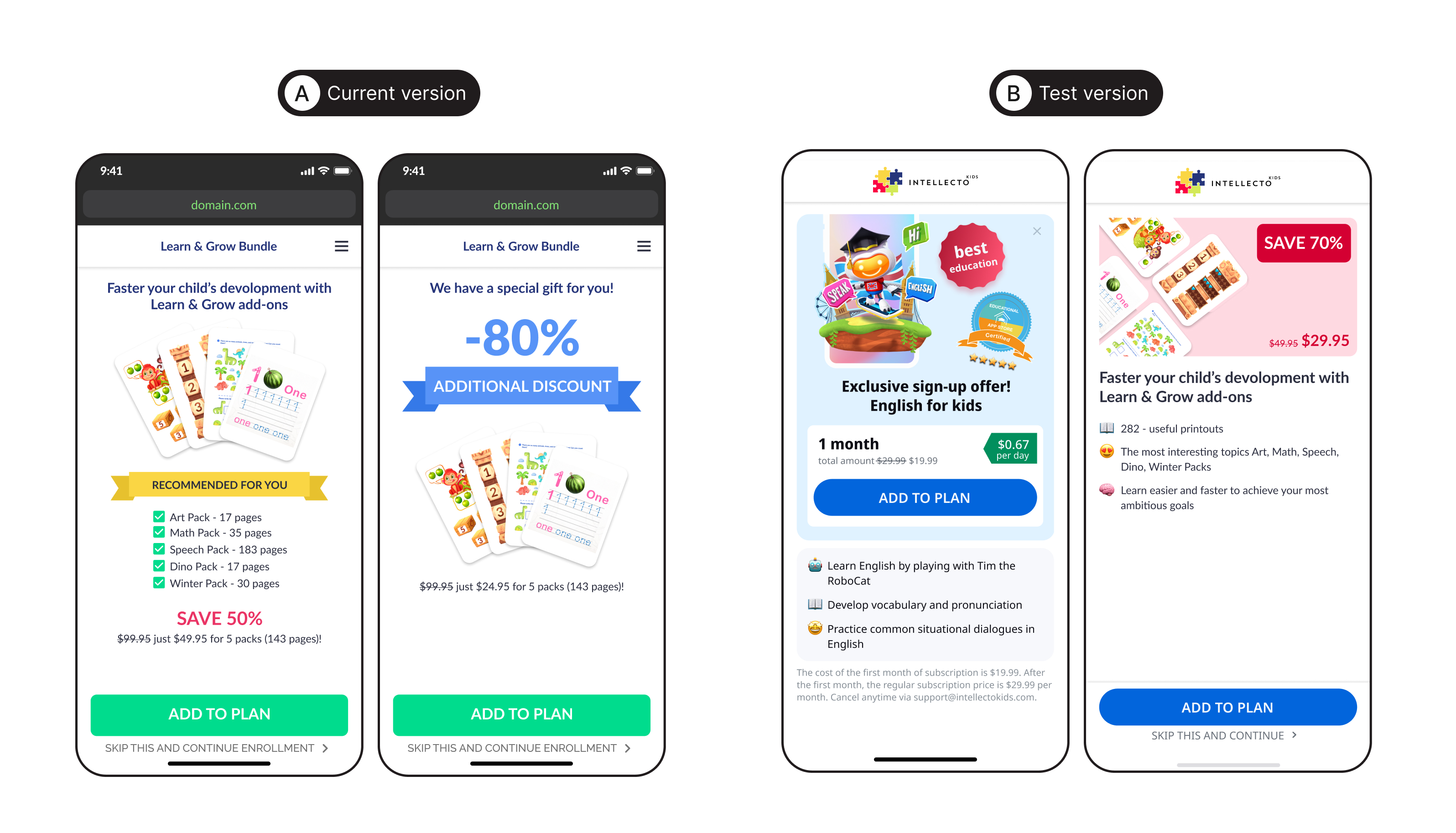
Hypothesis 2 — Stronger Focus on the Main Offer
The 3-month plan existed in the old design but visually competed with other interface elements. By making it the primary visual focus — through stronger contrast, a "Best Price" badge, and more prominent visual treatment — users would perceive it as the recommended option.
Implementation
During the test, we analyzed:
- subscription conversion
- interaction with pricing plans
- selection of the primary offer
- impact on trial activation
Result
- increased visibility of the main offer
- made subscription choices clearer
- reduced cognitive load during decision-making
- strengthened purchase motivation through urgency mechanics
- improved the overall effectiveness of the paywall flow
Impact
As a result, we observed a significant increase in conversion to paying customers.