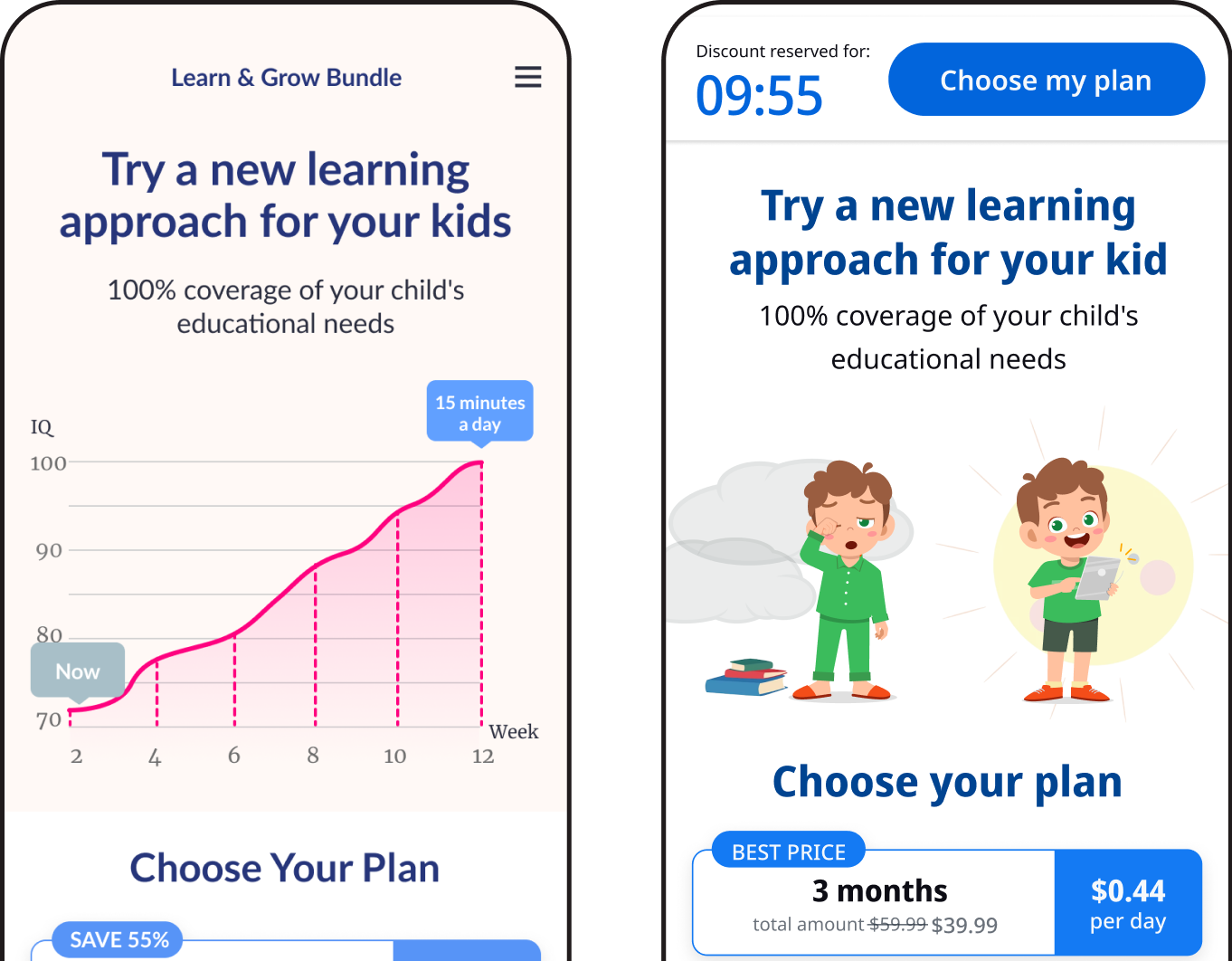
AskGPT — Growth Funnel Redesign
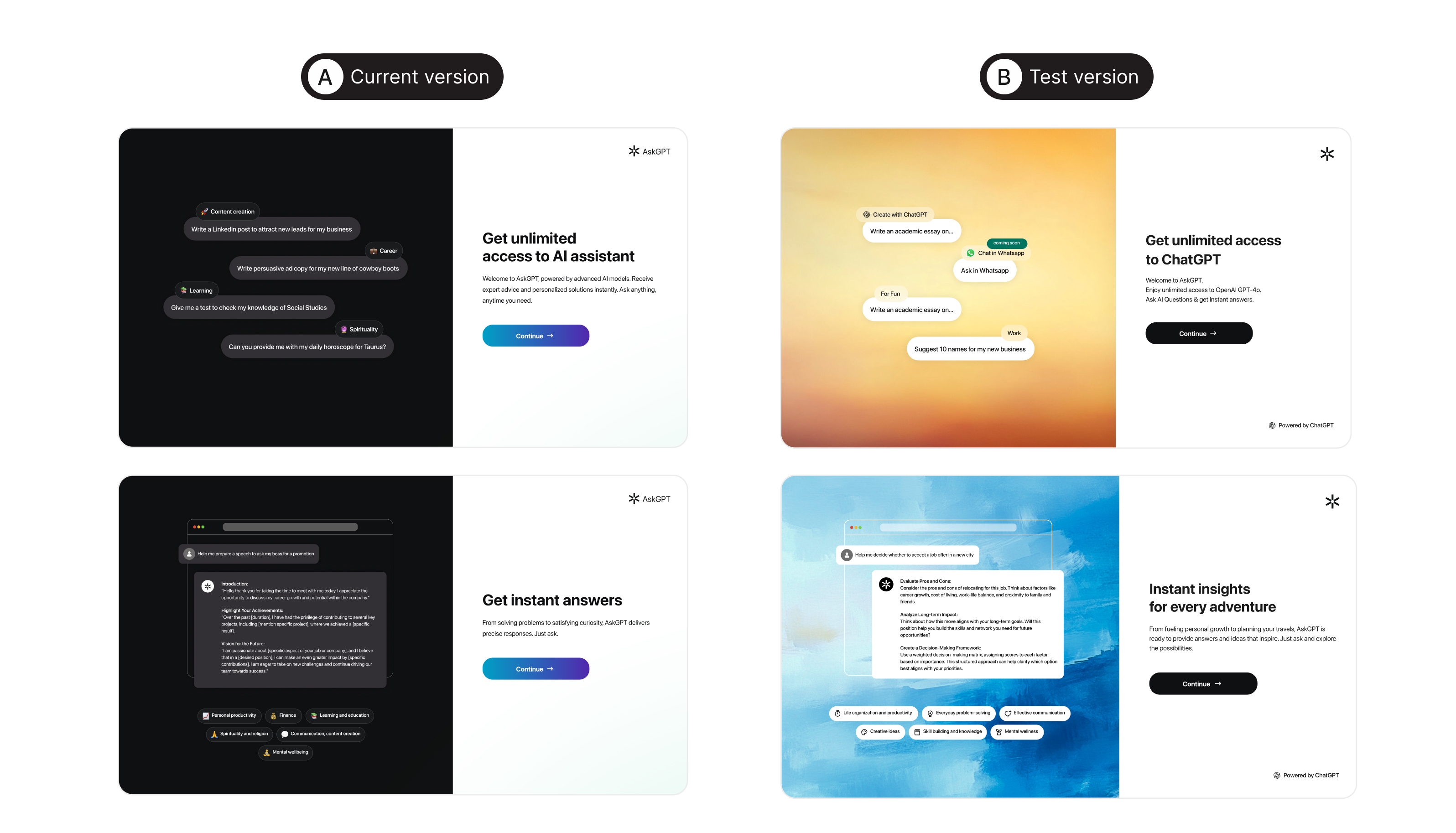
Problem
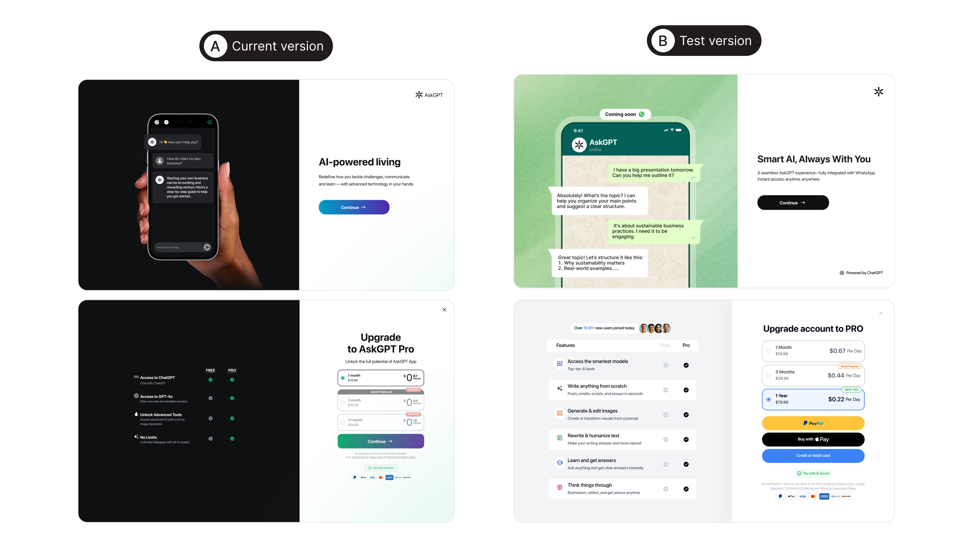
The existing onboarding experience felt overloaded and visually overwhelming for users. Users were exposed to too much information, complex visual hierarchy, and unclear communication of the product's value.
The previous funnel:
The previous funnel:
- reduced engagement during the early stages of the user journey
- failed to guide users effectively through the activation flow
- did not create enough motivation to subscribe
Insight
For AI products, it is critical to communicate user value as quickly as possible and reduce friction within the onboarding funnel.
Users respond better to:
Users respond better to:
- clean visual structure
- emotional communication
- clear usage scenarios
- a modern visual-first approach
Goal
Redesign the onboarding and paywall funnel to:
- reduce cognitive load
- improve onboarding completion rate
- increase activation
- improve conversion to subscription
- make the value proposition more emotional and easier to understand
- improve overall funnel performance
Research & Growth Analysis
Together with the growth team, we conducted funnel analysis and user behavior research.
We identified that:
We identified that:
- users did not understand the main product use cases
- onboarding failed to create emotional engagement
- visual hierarchy distracted users from key CTAs
- paywall screens did not build enough motivation to purchase
Growth Hypothesis & Key Decisions
A more emotional and lifestyle-oriented presentation of the product would help users associate the AI tool with their everyday tasks faster and increase engagement.
Key decisions:
Key decisions:
- Redesign the visual hierarchy of the screens
- Make onboarding more storytelling-oriented
- Use real AI use cases instead of abstract descriptions
- Strengthen focus on key CTAs
- Introduce a more modern emotional visual language
- Make the paywall more focused on value communication
Implementation
As part of the redesign, we updated onboarding flow, paywall screens, visual system, AI use case presentation, and CTA placement.
After several iterations and A/B testing, we:
After several iterations and A/B testing, we:
- simplified the user journey
- improved information architecture
- increased emotional engagement
- reduced visual noise
- improved readability and focus on key actions
Results
The updated onboarding/paywall funnel achieved:
- more than 40% growth in overall conversion
- a 15% increase in subscriptions
- improved activation rate
- higher onboarding completion rate
- reduced drop-off within the funnel
- increased user engagement
Impact
Additionally:
- users understood the product value proposition faster
- perception of the AI functionality improved
- interaction with paywall screens increased
- onboarding became significantly easier and faster to complete
+40%
Overall conversion
+15%
Subscriptions